Ryan Ponton, M.D.
When Dr. Ryan Ponton approached me to brand his name to promote his practice in Coastal Virginia, I was very excited to create a mark unique to his name that also tied into his profession as a hand surgeon.
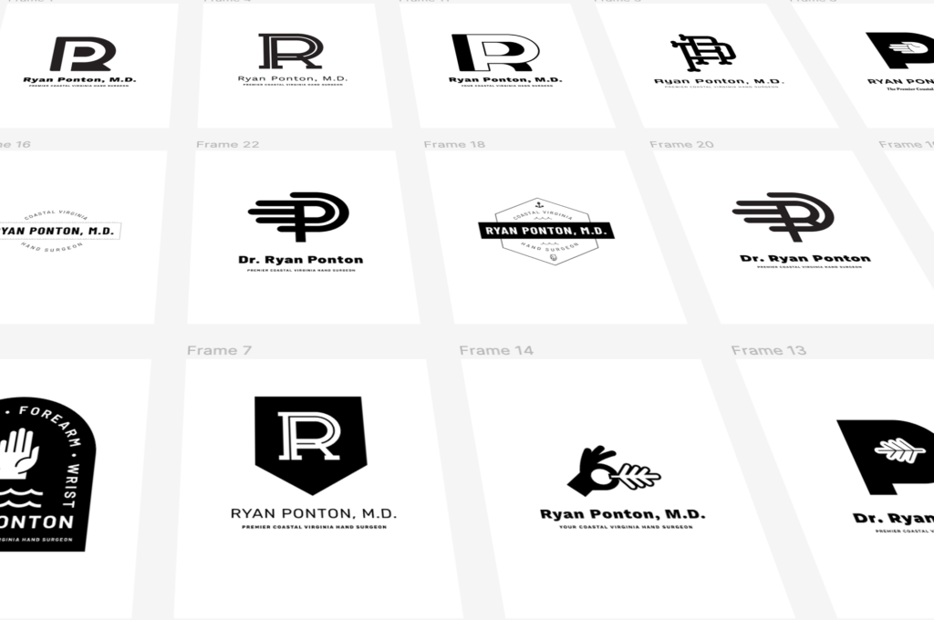
First, we talked about elements that would work with his brand and logo mark. I always send a logo/design survey to my clients to let them give me input on their vision, as well as pertinent questions to help us come up with the best creative solution. In this case, keywords for his brand included “hand”. “surgeon”, “coastal”, “Virginia”, “Navy”, and “waves” to name a few…

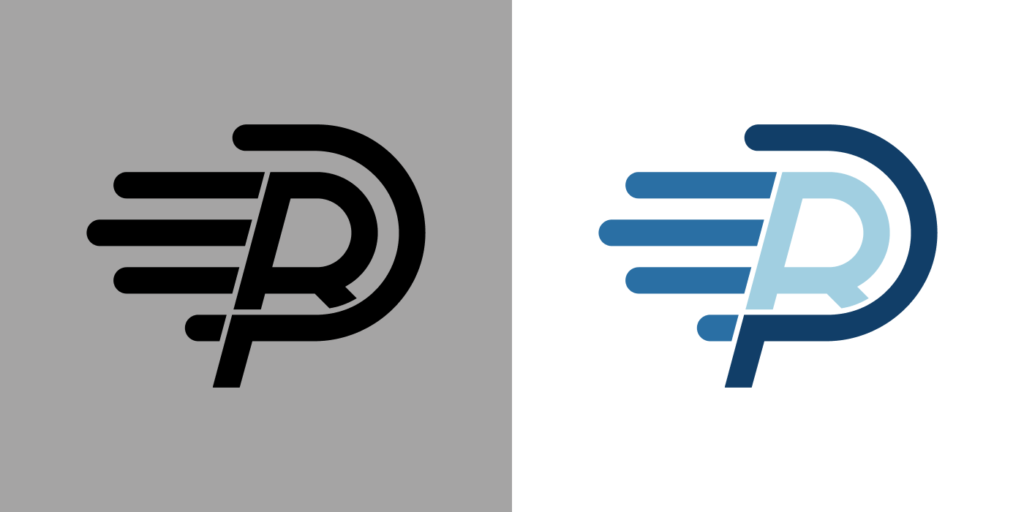
After several design rounds, Dr. Ponton and I both agreed on the strongest mark – the “RP”, which stands for Ryan Ponton, being seen within the shape of a hand. Being an active runner and someone known for his hard work- we gave the mark a sense of movement with a slight angle to the right.
Once we had the mark, we worked through color ideas that worked together the best to promote his brand…

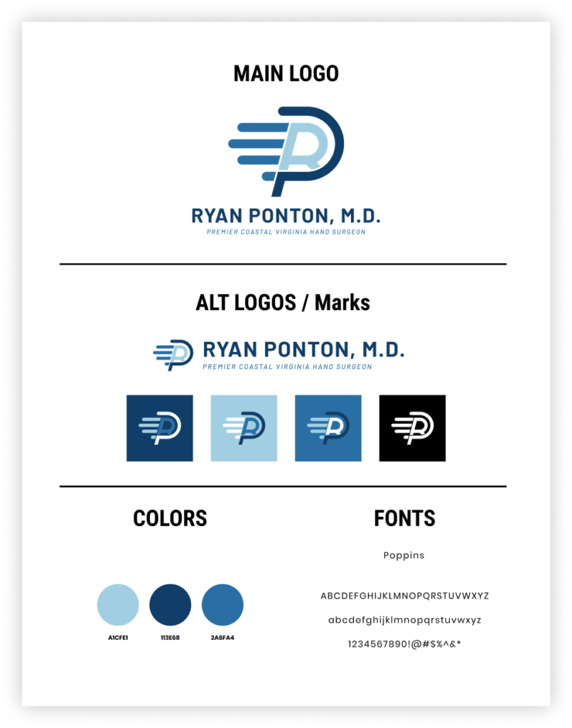
The next step was putting it all together into a style sheet. This is to ensure if he promotes his brand the user will know the exact colors, fonts and styles to adhere to. This will also ensure Dr. Ponton’s brand retains its elements…

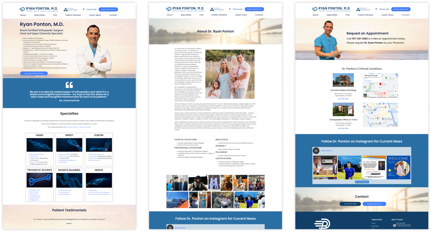
With his brand complete, we moved on to creating his website. I laid out the initial designs in Figma to help me figure out the User Experience.
Once design and copy elements were complete created the User Interface in Elementor Pro and pushed his website live.
Click here to visit his live website…
With everything complete, I created a branded video to announce his new website to be shared on all of his social media channels and used in direct communication efforts.

